CROSSTABLES IN R | DATA VISUALIZATION
A crosstable, also known as a contingency table, is a table showing the frequency of occurrences of certain events or values within different groups or categories. In R, the table() function can be used to create a crosstable.
For example, if you have a categorical variable "Gender" and another categorical variable "Age group", you can create a crosstable showing the number of occurrences of each age group for each gender by running:
# Create example data
Gender <- sample(c("Male", "Female"), 100, replace = TRUE)
Age <- sample(18:80, 100, replace = TRUE)
Age_Group <- cut(Age, c(18, 30, 40, 50, 60, 70, 80), labels = c("18-29", "30-39", "40-49", "50-59", "60-69", "70-79"))
data <- data.frame(Gender, Age_Group)
table(data$Gender, data$Age_Group)
18-29 30-39 40-49 50-59 60-69 70-79
Female 15 8 6 9 7 10
Male 10 11 7 6 3 8
install.packages("reshape2")
library(reshape2)
ct <- table(data$Gender, data$Age_Group)
ct_melt <- melt(ct)
ggplot(ct_melt, aes(x=Var1, y=value, fill=Var2)) +
geom_bar(stat='identity', position='dodge')
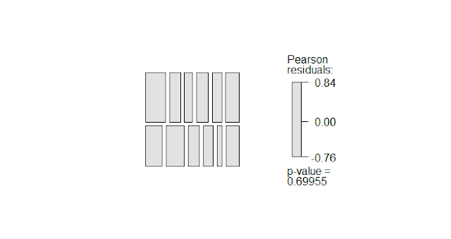
The mosaic() function is a function from the vcdExtra library that you've loaded, it creates a mosaic plot, which is a graphical representation of a crosstable. The code you provided will create a mosaic plot of the crosstable "cap_tab" with shaded cells and a legend.
The shade = T argument will color the cells according to the frequency. The legend = T argument will add a legend to the plot that shows the frequency of each cell.
library(vcdExtra)
cap_tab = table(data$Gender, data$Age_Group)
cap_tab
mosaic(cap_tab, shade = T, legend = T )
install.packages("gplots")
library(gplots)
balloonplot(cap_tab)
library(MASS)
str(bacteria)
'data.frame': 220 obs. of 6 variables:
$ y : Factor w/ 2 levels "n","y": 2 2 2 2 2 2 1 2 2 2 ...
$ ap : Factor w/ 2 levels "a","p": 2 2 2 2 1 1 1 1 1 1 ...
$ hilo: Factor w/ 2 levels "hi","lo": 1 1 1 1 1 1 1 1 2 2 ...
$ week: int 0 2 4 11 0 2 6 11 0 2 ...
$ ID : Factor w/ 50 levels "X01","X02","X03",..: 1 1 1 1 2 2 2 2 3 3 ...
$ trt : Factor w/ 3 levels "placebo","drug",..: 1 1 1 1 3 3 3 3 2 2 ...
df = bacteria
ggplot(df, aes(x=trt, y=week, fill=hilo)) +
geom_col(position = "dodge")
Load the Titanic dataset
data(Titanic)
Create a crosstable of Survived by Gender
ct <- table(Titanic$Survived, Titanic$Sex)
Create a stacked bar chart of the crosstable
ggplot(melt(ct), aes(x=Var1, y=value, fill=Var2)) +
geom_bar(stat='identity', position='dodge') +
ggtitle("Survival by Gender") +
xlab("Survived") +
ylab("Count")
Heatmap
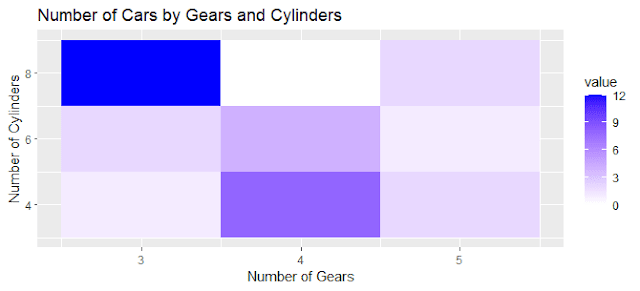
This code creates a heatmap that shows the relationship between the number of gears and cylinders and the number of cars in the mtcars dataset. The intensity of the color in the heatmap represents the value of the number of cars.Create a crosstable of the number of cars by number of gears and number of cylinders
ct <- table(mtcars$gear, mtcars$cyl)
Create a heatmap of the crosstable
ggplot(melt(ct), aes(x=Var1, y=Var2, fill=value)) +
geom_tile() +
scale_fill_gradient(low = "white", high = "blue") +
ggtitle("Number of Cars by Gears and Cylinders") +
xlab("Number of Gears") +
ylab("Number of Cylinders")
Create a scatter plot of the number of cars by number of gears and number of cylinders
ggplot(mtcars, aes(x=gear, y=cyl, color=mpg)) +
geom_point() +
ggtitle("Number of Cars by Gears and Cylinders") +
xlab("Number of Gears") +
ylab("Number of Cylinders")
 |
Pie Charts
load the library
library(tidyverse)
create a dataframe
df <- data.frame(
category = c("A", "B", "C", "D"),
value = c(20, 30, 40, 10)
)
create a pie chart
ggplot(df, aes(x = "", y = value, fill = category)) +
geom_bar(width = 1, stat = "identity") +
coord_polar("y", start = 0) +
ggtitle("Pie Chart Example")


.png)


Comments
Post a Comment