DATA VISUALIZATION WITH R
DATA
VISUALIZATION WITH R
GGPLOT2
Data has an important place today. People, companies, and
governments who have data and use it effectively on timely manner ,will have a
say in the future of the world.
There is a data chaos in the world. While millions of data
are produced per second, the answer to how we can use this data actually
creates new strategies. In order not to be deprived of these strategies, we
must find a way to make sense of the data. Data visualization is one of the
methods that allows us to get out of this chaos or guide us to get rid of this
chaos. We understand more easily what a dataset is trying to tell us when we
visualize it.
In this blog post, I will tell you how to visualize data
with R ggplot2.
“R has several
systems for making graphs, but ggplot2
is one of the most elegant and most
versatile.”*
First we will use data, aes
and geom to visualize the data with ggplot.
Data----à dataset
Aes-----àAesthetic
properties of data. We will specify the color, size, shape, labels,
transparency of the images and many more arguments in aes
Geom--à kind
of the chart
#I have activated the ggplot2 package
library(ggplot2)
#I looked through the general properties of the diabetes data
that we will visualize with the str().
> str(diabetes)
'data.frame': 145 obs. of
4 variables:
$ class
: Factor w/ 3 levels "Chemical","Normal",..: 2 2 2 2
2 2 2 2 2 2 ...
$ glucose: num
80 97 105 90 90 86 100 85 97 97 ...
$ insulin: num
356 289 319 356 323 381 350 301 379 296 ...
$ sspg
: num 124 117 143 199 240 157 221
186 142 131 ...
# I visualized the insulin and glucose features in the diabetes
dataset, which have numeric values, with a point graph.
ggplot(data =
diabetes)+
geom_point(mapping = aes(x = glucose, y =
insulin), color = "red")

#I can also get the same image without using data and mapping.
ggplot(diabetes)+
geom_point(aes(x = glucose, y = insulin),
color = "red")

#It can also be used this way.
ggplot(diabetes,aes(x
= glucose, y = insulin))+
geom_point(color = "blue")
or
ggplot(diabetes,aes(glucose,
insulin))+
geom_point(color = "blue")

#When I remove the color, it will use black color by default.
ggplot(diabetes)+
geom_point(aes(x = glucose, y = insulin))

#I created a dot chart with the color I want by writing the
color outside of aes in the previous chart. Now I will write the color in aes and examine the breakdowns of
the feature(class) I want.
ggplot(diabetes)+
geom_point(aes(x = glucose, y = insulin,
color = class))

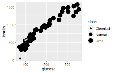
#If the data was continuous then I would use size instead of color. Using size for a discrete variable is not advised.But I used the size.
ggplot(diabetes)+
geom_point(aes(x = glucose, y = insulin, size
= class))
Warning message:
Using size for a discrete variable is not advised.
#shape makes the points on the chart appear in different shapes
(triangle, square, etc.). In addition, more than 6 variables cannot be
displayed on the chart with shape. That is, if the class had 8 variables
instead of 3, only 6 would be visible and the other 2 would not.
ggplot(diabetes)+
geom_point(aes(x = glucose, y = insulin,
shape = class), color = "blue")

# alpha is used to make it transparent. However, it is not
recommended to use categorical and discrete variables as in the size command.
ggplot(diabetes)+
geom_point(aes(x = glucose, y = insulin,
alpha = class), color = "purple")
Warning message:
Using alpha for a
discrete variable is not advised.

# I think what comes to mind is what comes to mind for you too.
So what happens if we use all the features at the same time? I think it's awesome.
ggplot(diabetes)+
geom_point(aes(x = glucose, y = insulin,
alpha = class, color = class, shape=class), color = "purple")

# glucose- sspg- class
ggplot(diabetes)+
geom_point(aes(x = glucose, y = sspg, alpha =
class, color = class, shape=class), color = "purple")

# Even if we don't specify x and y, it will detect it as
default.
ggplot(diabetes)+
geom_point(aes(glucose, sspg, color = class,
alpha = class, shape=class), color = "purple")

# you can change the variables and I used the size
ggplot(diabetes)+
geom_point(aes(glucose*2, insulin/sspg, size
= class, alpha = class, shape=class), color = "purple")

# I think I caught your attention in terms of design. It can be
used this way in long codes.
# we can also draw a line graph.
ggplot(diabetes,
aes(glucose, insulin,
color = class,
alpha = class,
shape=class))+
geom_point()+
geom_line()

In this blog post, I mentioned the
importance of data and data visualization. With the ggplot2 package, I did
various data visualization exercises on the diabetes dataset. See you in another blog
post.
You can follow me on Linkedin and
github.
https://www.linkedin.com/in/adem-bak%C4%B1rc%C4%B1/
https://github.com/edmbkrc
*Hadley
Wickham & Garrett Grolemund | R for
Data Science
.png)


Comments
Post a Comment