LATTICE PACKAGE IN R-DATA VISUALIZATION
The lattice package is a powerful data visualization library for the R programming language. It is designed to provide a high-level interface for creating attractive and informative statistical graphics. The package is built on top of the grid graphics engine, which provides a consistent API for creating a wide variety of plots.
It is written by Deepayan Sarkar. Numerous helpful functions are offered by the lattice package, which can produce single factor graphs (such as dot plots, histograms, bar plots, and box plots), bivariate graphs (such as scatter plots, strip graphs, and parallel boxplots), and multivariate charts (three-dimensional graphs and scatter plot matrixes).
In this format:

> dotplot(~SE, USMortality, col = "blue") Bivariate Dot Graph
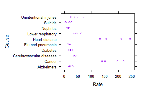
> xyplot(Cause ~ Rate, USMortality, col = "purple")

> dotplot(Sex ~ Rate, USMortality, col = "chocolate")
Trivariate Point Graph
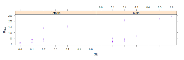
>dotplot(Rate ~ SE | Status, USMortality, col = "blue") > xyplot(Rate ~ SE | Sex, USMortality, col = "purple")
Bar charts


3D Pie Charts
>install.packages("plotrix", dependencies = TRUE)
>library(plotrix)
>pie3D(pregnant,labels=diabetes,explode=0.1,
main="Pie Chart of Diabetes ")
Drawing Charts by Sorting by Groups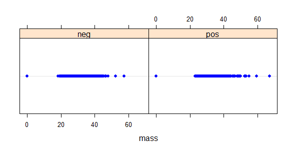

Coloring Operations

Install the lattice package
> install.packages("lattice")
load lattice
> library(lattice)
Common graph_function:
xyplot(): Scatter plot
splom(): Scatter plot matrix
cloud(): 3D scatter plot
stripplot(): strip plots (1-D scatter plots)
bwplot(): Box plot
dotplot(): Dot plot
barchart(): bar chart
histogram(): Histogram
densityplot(): Kernel density plot
qqmath(): Theoretical quantile plot
qq(): Two-sample quantile plot
contourplot(): 3D contour plot of surfaces
levelplot(): False color level plot of surfaces
parallel(): Parallel coordinates plot
- y ~ x | A * B
- The primary variable is on the left, and the conditioning variable is on the right.
- y ~ x: y on the y-axis and x on the x-axis
- If there is only one variable, use ~ x rather than y~ x.
- Use z~ x*y instead of y~ x for a 3D plot.
- Use data.frame rather than y~ x for multivariate graphs such as scatter matrices and parallel coordinate plots.
- ~x|A represent plot x with each level of factor A.
- Plot the relationship between y and x as y~ x|A*B represents given levels of A and B.
In this section, I make use of the USMortality dataset to provide examples for convenience.
attach(USMortality)
> str(USMortality)
'data.frame': 40 obs. of 5 variables:
$ Status: Factor w/ 2 levels "Rural","Urban": 2 1 2 1 2 1 2 1 2 1 ...
$ Sex : Factor w/ 2 levels "Female","Male": 2 2 1 1 2 2 1 1 2 2 ...
$ Cause : Factor w/ 10 levels "Alzheimers","Cancer",..: 6 6 6 6 2 2 2 2 7 7 ...
$ Rate : num 210 243 132 155 196 ...
$ SE : num 0.2 0.6 0.2 0.4 0.2 0.5 0.2 0.4 0.1 0.3 ...
Univariate Point Graph
> dotplot(~Rate, data = USMortality, col = "red")

> dotplot(~SE, USMortality, col = "blue")

> xyplot(Cause ~ Rate, USMortality, col = "purple")
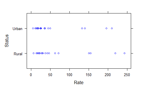
> xyplot(Status ~ Rate, USMortality, col = "blue")
> dotplot(Sex ~ Rate, USMortality, col = "chocolate")

Trivariate Point Graph
> xyplot(Rate ~ SE | Cause, USMortality, col = "purple")


Bar charts
>barchart(Rate ~ Cause, USMortality,
main = "Bar Chart in USMortality",
xlab = "Cause Value",
ylab = "Rate Value",
col = c("chocolate", "green", "grey", "blue"))

>barchart(SE ~ Rate | Cause, USMortality,
main = "Bar Chart in USMortality",
xlab = "Rate Value",
ylab = "SE Value",
col = c("chocolate", "red", "grey", "blue"),
horiz = T)

barchart(SE ~ Rate | Status, USMortality,
main = "Status Bar Chart in USMortality",
xlab = "Rate Value",
ylab = "SE Value",
col = c("chocolate", "red", "grey", "blue"),
horiz = F)

barchart(SE ~ Rate | Sex, USMortality,
main = "Sex Bar Chart in USMortality",
xlab = "Rate Value",
ylab = "SE Value",
col = c("red","chocolate","purple", "blue"),
horiz = F)

Pie Charts
👉In this section, I make use of the PimaIndiansDiabetes dataset to provide examples for convenience.
> str(PimaIndiansDiabetes)
'data.frame': 768 obs. of 9 variables:
$ pregnant: num 6 1 8 1 0 5 3 10 2 8 ...
$ glucose : num 148 85 183 89 137 116 78 115 197 125 ...
$ pressure: num 72 66 64 66 40 74 50 0 70 96 ...
$ triceps : num 35 29 0 23 35 0 32 0 45 0 ...
$ insulin : num 0 0 0 94 168 0 88 0 543 0 ...
$ mass : num 33.6 26.6 23.3 28.1 43.1 25.6 31 35.3 30.5 0 ...
$ pedigree: num 0.627 0.351 0.672 0.167 2.288 ...
$ age : num 50 31 32 21 33 30 26 29 53 54 ...
$ diabetes: Factor w/ 2 levels "neg","pos": 2 1 2 1 2 1 2 1 2 2
df = PimaIndiansDiabetes
> pregnant = table(df$pregnant)
> diabetes = table(df$diabetes)
> pie(pregnant, labels = diabetes, main="Pie Chart of Diabetes")

3D Pie Charts
>install.packages("plotrix", dependencies = TRUE)
>library(plotrix)
>pie3D(pregnant,labels=diabetes,explode=0.1,
main="Pie Chart of Diabetes ")

Drawing Charts by Sorting by Groups
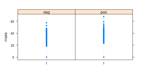
>dotplot(~mass | diabetes, df, col = "blue")

>df1 = data.frame(df, GR = factor(1))
>dotplot(mass ~ GR | diabetes, data = df)
Coloring Operations
red = rgb(249/255, 254/255, 47/255)
amber = rgb(255/255, 126/255, 0/255)
green = rgb(39/255, 121/255, 51/255)
bwplot(glucose ~ age , data = df, col = "black",
panel = function(...){
panel.bwplot(..., groups = df$diabetes,fill = c(red, amber, green))
})

You can follow me on Linkedin and github.
https://www.linkedin.com/in/adem-bak%C4%B1rc%C4%B1/
https://github.com/edmbkrc
.png)


Comments
Post a Comment